Introduction
Banding is a projection of who a person is. It is a tool that can be used to help employers and the public determine who you are as a media creative. (Rangarajan et al. 2017)
Research Case Study – Urban Outfitters
The best way to learn what a style guide really is is to look at other brand’s style guides. With this in mind, we looked at a few in class, the most memorable of them being the one for urban outfitters. This helped consolidate my understanding of the components that go into making a brand including things such as tone of voice.
Having a consistent brand over platforms is important as it helps to promote a sense of validity and reliability as the client will be able to identify one of your products by your branding. This can also aid you in getting work as it helps with the idea of risk reduction since your brand is clear and the client knows what they are getting (Fischer et al. 2010).
Aesthetics
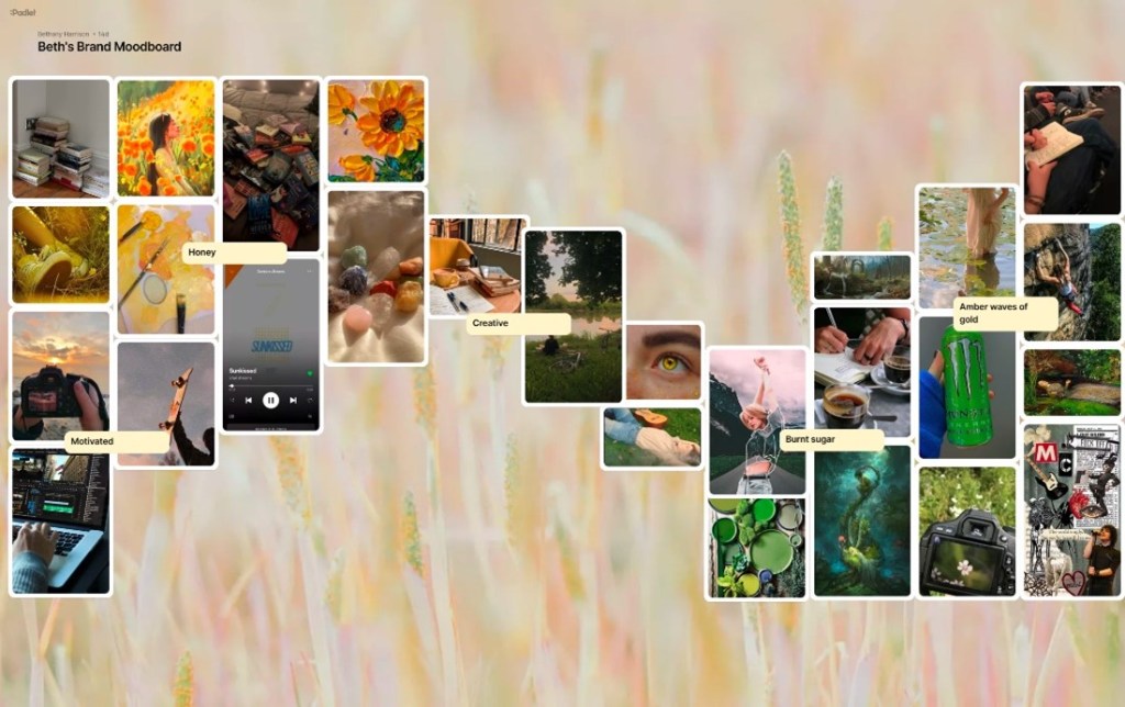
When looking to construct my brand I have begun with the basics of aesthetics. In order to gain a better insight into a possible colour scheme for my brand and artwork, I constructed a mood board using padlet to attempt to visually depict my own personal style. As you can see, the main colour scheme for my brand shall consist of shades of yellows and greens which shall also be reflected in my logos. I picked mainly bright shades of these colours and found images that were representative of my hobbies.
Logo
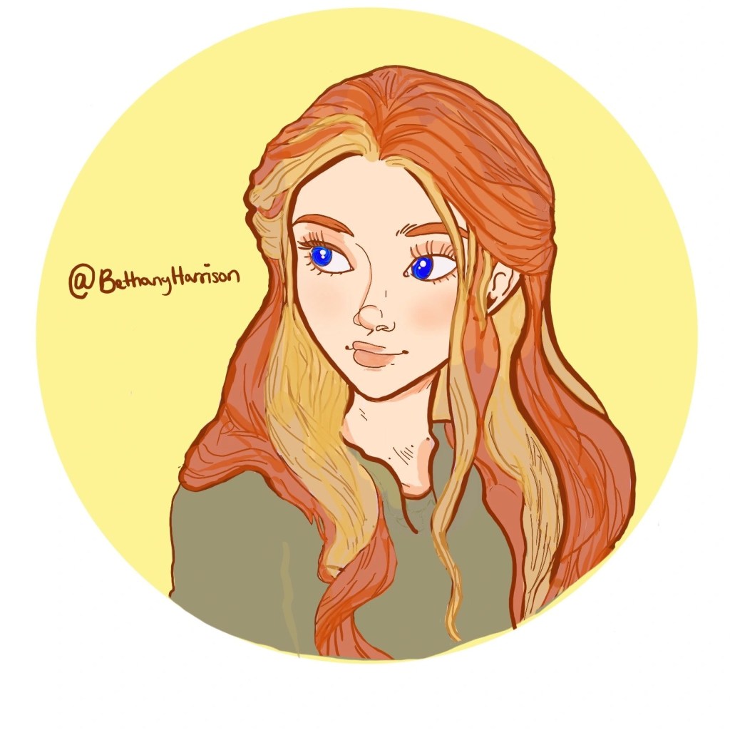
For my logo, I wanted two versions; one that had an illustration of simply my name and a more detailed one that had an illustration of me in it too. Recently I learned digital art which now allows me to construct my own illustrations and artwork, using adobe procreate. When looking for initial inspiration I looked at the self-portraits I had already taken and found the perfect one to use for my inspiration. The reasoning behind this, I that I believe having my own artwork would once again demonstrate my skill but also give my brand a more personal feel as it would have my avatar as part of it. This may change at a later stage in my career as I do want to appear as professional but for now, creating a logo in this manner will be the best action.
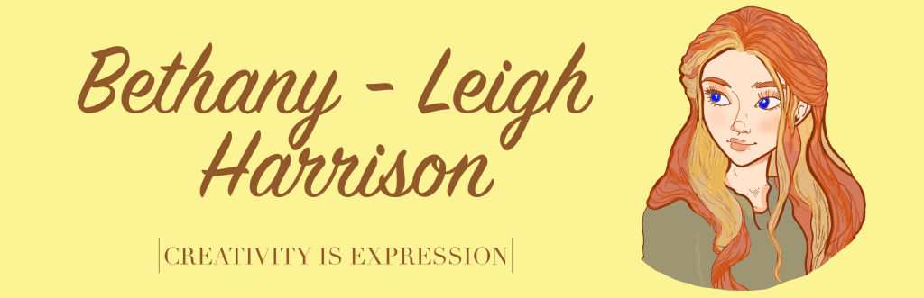
The next thing to consider was typography. I wanted to select a font that reflected the more artsy nature of my brand but was still professional and easy to read. One of the most common fonts used is comic sans which is a sans serif font, and it is a very common font due to its accessibility. Ultimately, I plan to use my usual handwritten calligraphy for my logo, depending on the colours within the logo I will most likely use either a lighter brown or darker green to stick to my colour scheme. Similarly, I kept consistency with my business card, but I also added the tagline from my website “Creativity is expression”. However, this business card is incomplete so I will need to come back to it in the future and finish it by adding my contact details.
Draft 1
Conclusion
To conclude, I will continue to develop the aesthetics of my brand in order to construct my final style guide in conjunction with the progression of my brand.
Bibliography
FISCHER, M., F. VÖLCKNER and H. SATTLER, 2010. How Important Are Brands? A Cross-Category, Cross-Country Study. Journal of Marketing Research, 47(5), 823-839
RANGARAJAN, D., B.D. GELB and A. VANDAVEER, 2017. Strategic personal branding—And how it pays off. Business horizons, 60(5), 657-666

Leave a comment