
Introduction
Upon completing any piece of work, reflection is essential. Reflection allows us to better our skills through identifying the effectiveness of our project. More than that, it aids us in learning how to formulate a plan from that (Gibbs, 2020). In this post, I shall reflect on my portfolio as a whole and my experience with the process.
Reflection on the process
It is important to first consider the original aims of my project, to create a technically accurate portfolio that displays a community. Naturally, there were challenges with the technicality of my portfolio, mainly due to lighting, which I managed to effectively combat using artificial lighting and post-production editing. Overall, the process of photographing the images was an enjoyable experience in which I was able to take a wide range of shots to choose from.
Editing
What I had originally found interesting about Steele- Perkins and Kalvar’s work was that they both adopted the approach of making their images black and white. Ordinarily, the colours in an image are considered crucial for photography as colour theory can be used to depict certain emotions from the colours within an image. With this in mind, I had previously adopted the view that a lack of colour would lead to less clear communication regarding the meaning of the shots due to colour psychology.
The premise of colour psychology states that different colours hold certain emotions in association with them. These colours then evoke an emotion from the audience (Cherry, 2024). For example, vibrant colours are primarily associated with happiness and the muted tones often associated with darker emotions. However, it is possible to determine that, within the context of Steele-Perkins and Kalvar’s portfolios, the choice to strip the image of any bright colours was used to exemplify the emotions of the photographs and what was happening in them. Without colour, the audience are guided to focus on the expressions of the people in the photographs. For that reason, I shall adopt this in my own work to create visually stimulating images focused on the subjects.
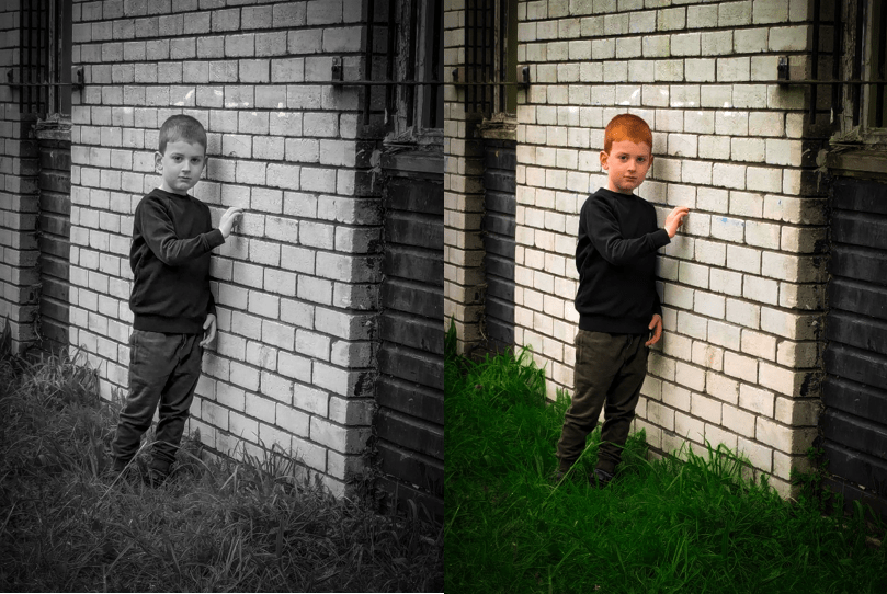
Displayed is one of the images from my portfolio. Here it is clear that in the more vibrant image, the eye is drawn to the surrounding of the boy as opposed to him. This reinforced my decision that editing the images to be in black and white would aid me in more accurately conveying the meaning of the portfolio.
Conclusion
The title for my portfolio shall be ‘The Home of Divergence’. I chose this because it summarises the meaning of my portfolio and of CASPA. Even though everyone in this community is different they all belong. It is a community where they don’t have to feel alone. One where everyone can feel welcome not matter how different they may feel.
Bibliography
CHERRY, K., 2024. Color Psychology: Does It Affect How You Feel?Available from: https://www.verywellmind.com/color-psychology-2795824
GIBBS., G., 2020. Learning by Doing: A guide to teaching and learning methods.
HOWARD, E., 2018. A Sense of Community: Wolverhampton in the 1970s Available from: https://www.magnumphotos.com/arts-culture/society-arts-culture/chrs-steele-perkins-wolverhampton/
KALVAR, R., 2011. Richard Kalvar: Italia 150 Available from: https://www.magnumphotos.com/newsroom/society/richard-kalvar-italia-150/

Leave a comment